Published: 16 Jan 2020 | Author: James Honner
When we speak of applications development today, we assume DevOps is an integral part of the software development cycle. Modern microservices-based architectures facilitate the use of DevOps and the benefits of this are well known – agile development, quicker defect resolution, better collaboration, etc. Through containerisation using platforms such as Docker and container orchestrators such as Kubernetes and DC/OS, continuous integration and deployment become essential and not optional steps in daily activities. PaaS offerings in Microsoft Azure like AKS (Azure Kubernetes Service) make management of the platforms even simpler and thereby encourage uptake.
However, while DevOps practices have become mature in the applications development sphere, the same cannot be said when it comes to database development. To be able to build a true DataOps team that can integrate agile engineering processes encompassing IT and data teams, a DevOps mindset is essential. Many large enterprises as well as small organisations continue to follow age-old practices for developing data-related artefacts and as a result, we still see a lack of agility and at times, poor quality.
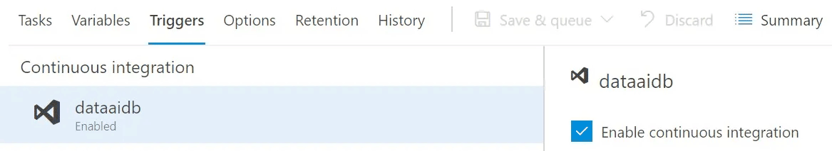
Microsoft has invested heavily to ensure that database developers can also leverage the benefits that have been reaped by application developers. Today’s SQL Server development IDE, SQL Server Data Tools (SSDT), comes loaded with features that enable a development team to collaborate and follow good programming practices. When combined with Visual Studio Team Services (VSTS), we get the environment needed to engender a DevOps-focused development culture.
At Talos, we believe DevOps is a foundational step in ensuring high-quality outcomes for our clients as part of a Modern Data Platform. Therefore, we make use of the toolsets made available by Microsoft in our development activities and adhere to strict policies, which are enforced by the tools. If you are looking to enable a similar culture in your database development team, consider the following guidelines –

These initial steps will ease the team into the DevOps culture. Look to get these steps right before moving to more advanced areas like automated unit testing, NuGet packaging, coupling database with application changes, etc.
Through the use of a combination of mature tools and strict practices, a DevOps pipeline for database-related development activities is no longer a pipe dream. As MapR’s Chief Architect Ted Dunning has predicted, a sophisticated DataOps team comprising of data-focused developers and data scientists will be the way of the future (MapR press release). Sound DevOps practices will be the first step towards getting there.
In Part 1 we saw how we can take our Power BI Reports to the next level by making them fully interactive, incorporating dynamic measures & dimensions. In part 2 we will tie it all together with Power BI Dynamic Visual Titles. In combination with Part 1’s Dynamic Measures & Dimensions, this concept greatly enhances the end user experience as they can monitor/analyse multiple measures and dimensions in a single report page at the click of a button.
Using the same financial dataset from Part 1, we will create 2 types of dynamic visual titles. One using a combination of the Selected Measure and Selected Time data attributes we created in Part 1 with some free text and the second will be a combination Selected Measure, Selected Time, free text and the selected filter from another visual.
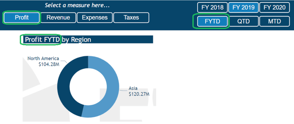
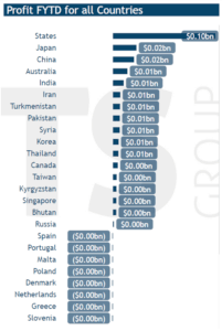
In the Donut chart visual below, we have selected the ‘Revenue’ measure (using Selected Measure ) and the ‘MTD’ period (using Selected Time ) from our Chiclet Slicers and we can see these are reflected in our Donut charts title.
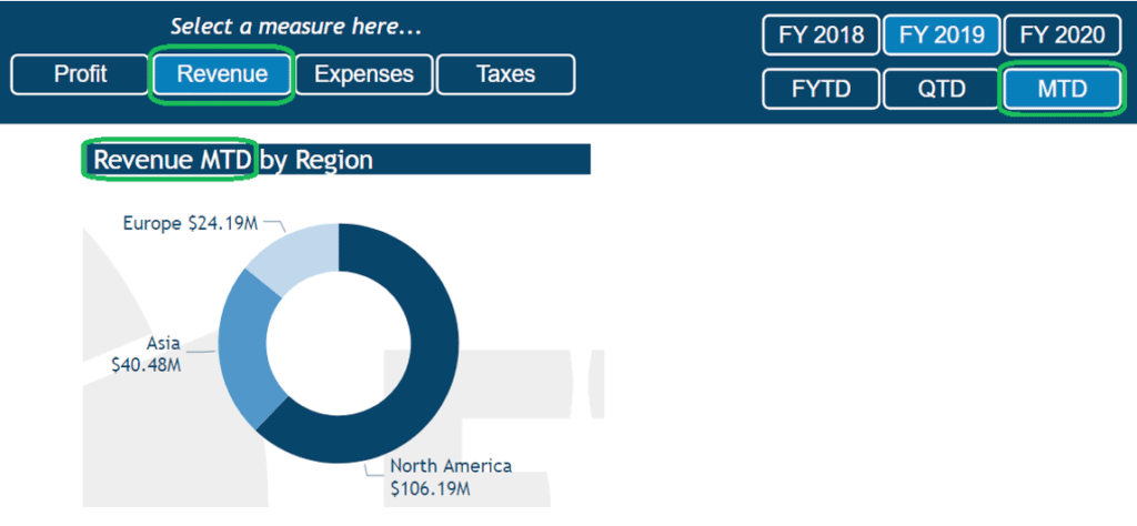
When we change our selection using the Chiclet Slicer, the Donut charts title updates to reflect our new selections as seen below.
How to
This is achieved by creating measures for each of your visual titles, and again utilising the SELECTEDVALUE DAX function we used in Part 1.
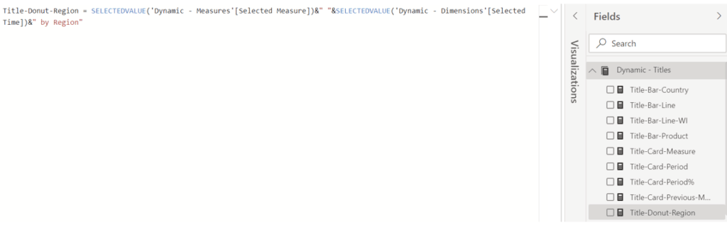
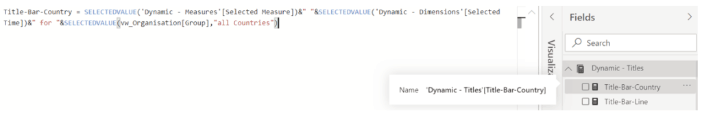
Let’s start by creating the measure, called ‘Title-Donut-Region’, that we’ll use for the Donut chart title by using the syntax below which joins (concatenates) the Selected Measure, Selected Time & the string “ by Region”.
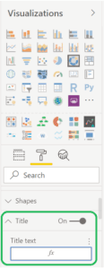
With the measure created we then add it to the Donut Visual by going to the Format options within the Visualisations pane and click on fx as seen below.
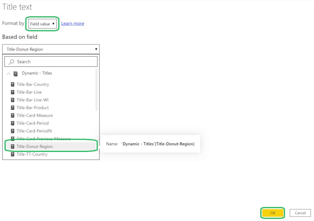
The following window will pop-up and we select ‘Format by Field value’ and then select our ‘Title-Donut-Region’ measure, click OK.
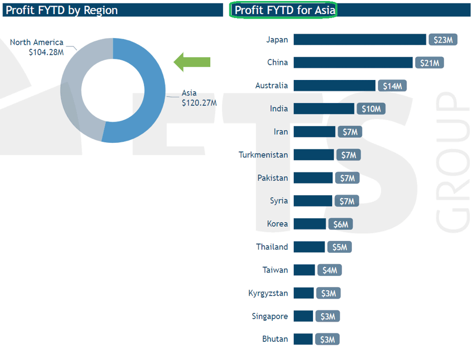
We can also extend this concept further by adding fields used in other visuals to our visual title measures, in this example, the ‘Region’ field used in our Donut chart visual. Below we have a Clustered bar chart visual showing our Selected Measure, Selected Time data attributes by Country.
In the ‘Title-Bar-Country’ measure as seen below, we have added the Region field (called ‘Group’ in our Data Model)
Now when we select a Region from our Donut chart visual, the Clustered bar chart visual by Country updates to show the Countries in that Region and our Clustered bar chart title also updates as seen below.
As you can see, Power BI Dynamic Visual Titles ties in together nicely with the Dynamic Measures & Dimensions and can greatly enhance the end users experience.
Summary
If you’d like to take your Power BI Reports and Dashboards to the next level and need help, please contact us to discuss how we can assist your organisation.

Get the latest Talos Newsletter delivered directly to your inbox
TECHNOLOGY PARTNERS
Our partners including Microsoft, UiPath, Databricks & Profisee enable us to deliver business outcomes using best of breed technologies and solutions.

Automation & Analytics Technologies for Business

Australian councils face backlogs, staff turnover, and rising community expectations. We help you improve service delivery and operational efficiency through process automation — integrated with TechnologyOne, Civica, and Pathway.

Talos helps organisations build reporting solutions using Jet Analytics
Talos helps organisations build modern data and analytics platforms using Databricks, Microsoft Fabric and Power BI. We work from strategy through implementation, ensuring you get value from the platform without unnecessary complexity.