
Published: 04 Jan 2024 | Author: Colin Smith
Power BI transforms raw data into stories that drive business decisions. But what turns a good story into a great one? It's not just the data itself, but how it's presented. A visually striking report grabs attention and makes complex information easier to digest. That's why mastering the art of visual presentation in Power BI is so crucial.
Let's talk about a key concept here: the data-to-ink ratio. Think of it like this - every element in your report should serve a purpose. This idea, championed by data visualisation expert Edward Tufte, encourages us to strip away anything that doesn’t add value to the data's story. Bombarding viewers with heavy graphics or fancy fonts might seem tempting, but it can distract from the real stars: the insights.
In this article, we're diving into five practical ways to make your Power BI reports not just informative, but visually impressive. We'll cover everything from smart background choices to custom themes, ensuring your reports are not only insightful but also a pleasure to look at. When we deliver projects using our PEBBLE Enterprise Power BI Methodology, these are areas we address under the Branding stage.
The power of bespoke background images in Power BI reports extends beyond mere aesthetics; they are a cornerstone of effective brand communication. According to a study by academic researchers in Maryland, colour increases brand recognition by up to 80%. This statistic underscores the importance of incorporating your company's brand identity into every aspect of your business communications, including data reports.
Imagine a report that not only conveys crucial data but also tells your brand's story through its visual elements. This harmonisation of data and brand identity is a crucial component of data storytelling in 2023. It shows your audience that your company values consistency and attention to detail, fostering a sense of trust and reliability.
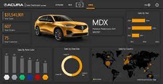 A perfect showcase of a Background Image used well.
Integrating your logo subtly, using your brand's colour scheme, or aligning with your company's visual style makes your report more than a data presentation; it becomes a key part of your brand's narrative. This strategic approach to branding in your reports does more than just present data; it reinforces your brand's presence and professionalism in every chart and graph.
One of the most impactful yet often overlooked features in Power BI is the ability to customise reports with a theming file. This tool is incredibly powerful as it creates a unified visual language for your data stories. A well-crafted theming file ensures that every element in your report - from fonts to colour palettes - aligns with your organisation's visual identity.
The beauty of a theming file lies in its simplicity and power. By defining a set of rules for your visuals, you establish consistency across all your reports. This isn’t just about looking good; it’s about making your reports instantly recognizable and easier to interpret. As noted in insights by Forbes, consistent visuals reduce cognitive load, meaning your audience can focus on the data insights rather than navigating through a maze of differing styles.
Moreover, custom theming supports brand reinforcement. Imagine every chart and every graph adhering to your brand's aesthetic, reinforcing your corporate identity with every data point. This level of customization elevates your reports from standard presentations to branded storytelling tools.
Crafting a visually perfect Power BI report isn't just about the aesthetics; it's fundamentally about how effectively you visualise your data. The key here is to match the right type of chart or graph to your data. Not all data are created equal, and neither should be their visual representations. Choosing the correct type of visualisation is critical to accurately and effectively conveying your data's story.
Bar charts, line graphs, pie charts, and scatter plots — each of these has its specific use case. For instance, bar charts are excellent for comparing quantities, while line graphs are ideal for showing trends over time. Understanding these nuances ensures your data is not only presented accurately but also in a way that is easy to understand and interpret.
The choice of visualisation also impacts how quickly and clearly your audience can grasp key insights. Cluttered or complex charts can confuse, leading to misinterpretation. Simplicity is often the key; a clear, well-designed chart will always trump a complex one in terms of effectiveness. This is where adhering to data visualisation best practices — choosing the right chart, keeping it simple, and focusing on clarity — can turn a good report into a great one.
Selecting the right colour palette is more than just an aesthetic choice; it's a strategic decision that can significantly impact the readability and effectiveness of your Power BI reports. Colours have the power to draw attention, evoke emotions, and highlight critical data points. But when used incorrectly, they can also lead to confusion and misinterpretation of data.
The key to effective colour usage in Power BI is consistency and contrast. Consistent use of colour helps in creating a cohesive look, while contrast ensures that important data stands out.
Another aspect to consider is colour blindness. Approximately 8% of men and 0.5% of women are affected by some form of colour blindness. Designing with this in mind, by avoiding problematic colour combinations like red-green, ensures that your reports are accessible to a wider audience. Thoughtful colour selection can make your reports not just visually appealing, but also inclusive and effective in communicating data insights to all viewers.
The inclusion of interactive elements in your Power BI reports can significantly elevate the user experience. Interactive features like slicers, drill-throughs, and tooltips not only make your reports more engaging but also empower users to explore the data in a personalised way. This level of interaction transforms a static report into a dynamic tool for discovery and analysis.
Slicers, for instance, allow users to filter data and focus on what’s relevant to them, making the report more adaptable to different needs. Drill-through features enable a deeper dive into specific aspects of the data, providing a more detailed view and understanding. Tooltips, when hovered over, can display additional information without cluttering the visual space. These elements make the report not just a presentation of data, but an interactive experience that encourages exploration and discovery.
Moreover, interactive elements help in catering to diverse user preferences and learning styles. Some users grasp information better through direct interaction, making these features invaluable.
Achieving visual perfection in Power BI is an art that combines aesthetics with functionality. From the strategic use of bespoke background images that reinforce brand identity to the careful selection of colour palettes for clarity and inclusivity, each aspect plays a pivotal role in creating an impactful report. Customising with theming files brings consistency and professionalism, while adhering to data visualisation best practices ensure your reports are both accurate and accessible.
The introduction of interactive elements further transforms your reports from static presentations to dynamic, user-engaging tools. This not only enhances the user experience but also supports deeper data exploration and understanding. Remember, the ultimate goal is to present data in a way that is not only visually appealing but also meaningful and insightful for your audience.
By applying these five methods, you’re not just presenting data; you're crafting a visual narrative that tells the story behind the numbers. It’s about making every report an opportunity to impress, engage, and inform. With these tips in hand, you’re well on your way to mastering the art of visual storytelling in Power BI.
Are you ready to take your Power BI reports to the next level? Get in touch with Talos today and we can start the process of creating a bespoke solution for your business.

Get the latest Talos Newsletter delivered directly to your inbox
TECHNOLOGY PARTNERS
Our partners including Microsoft, UiPath, Databricks & Profisee enable us to deliver business outcomes using best of breed technologies and solutions.

Automation & Analytics Technologies for Business

Australian councils face backlogs, staff turnover, and rising community expectations. We help you improve service delivery and operational efficiency through process automation — integrated with TechnologyOne, Civica, and Pathway.

Talos helps organisations build reporting solutions using Jet Analytics
Talos helps organisations build modern data and analytics platforms using Databricks, Microsoft Fabric and Power BI. We work from strategy through implementation, ensuring you get value from the platform without unnecessary complexity.