
Published: 19 Apr 2024 | Author: Colin Smith
No modern business can function in the absence of data, so more and more organisations are encouraging the use of business intelligence tools such as PowerBI outside of their data departments. PowerBI, Microsoft’s flagship analytics platform, offers unparalleled capabilities for transforming complex data into actionable insights through compelling visualisations. However, for those new to the platform, a series of common mistakes tend to be made, particularly in the area of visual design.
Effective visual communication is at the heart of PowerBI’s value proposition, enabling users to understand trends, outliers, and patterns in data. Yet, without a clear understanding of visual design principles, newcomers often find themselves making mistakes that can undermine the clarity and impact of their reports.
These mistakes, ranging from the misuse of colours to the overcrowding of visuals, can obscure the very insights they seek to highlight.
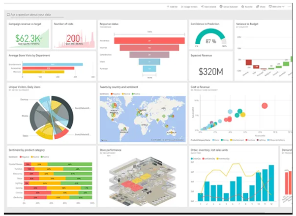
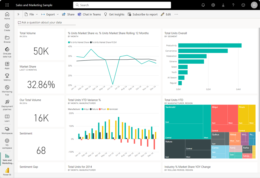 Microsoft uses this as an example of a well-crafted report page.
This article is crafted with the intent to guide PowerBI newbies through the maze of early visual design challenges. Drawing from our extensive experience in conducting bespoke PowerBI training sessions, we pinpoint the five most prevalent visual design errors encountered by beginners.
Our goal is to help you avoid these mistakes, ensuring your reports are not only visually appealing but, more importantly, effectively communicate the intended insights to your audience.
Inconsistent formatting leads to a scattered presentation of data, where the focus is lost among varying colours, fonts, and styles. This lack of uniformity can significantly affect the report’s professional appearance, making it seem less credible to stakeholders.
Furthermore, studies have shown that visual consistency enhances user experience by reducing cognitive load, allowing the viewer to process information more efficiently and accurately.
Achieving a consistent look and feel across your PowerBI reports doesn’t require sacrificing creativity for conformity. Instead, it's about establishing your design rules and sticking to them throughout the report. This can be accomplished by:
By dedicating time to the upfront selection of these elements, you can create a template that serves as a blueprint for all future reports. This not only streamlines the report creation process but also ensures that each report maintains a professional and coherent appearance.
Remember, your report is often the first impression stakeholders will have of your analysis. A report that looks disjointed or hastily put together can undermine the confidence in the data presented, even if that lack of confidence is totally unfounded.
Conversely, a report that boasts a clean, consistent design not only speaks to the professionalism of the analyst but also to the reliability of the insights it contains.
Selecting appropriate visuals is key to effective data communication in PowerBI. Consider these guidelines to ensure your visuals align with your data's narrative:
 Choosing the right visual for your analysis is a crucial aspect of effective reporting.
Choosing the correct visual type can significantly enhance your report’s clarity and prevent potential misinterpretation, ensuring your Power BI reports convey the intended insights accurately and effectively.
Colour is a powerful tool in data visualisation, but its overuse in Power BI reports can lead to confusion rather than clarity. Here’s how to use colour effectively:
 Image Credit: Numerro
By judiciously applying colour, you can enhance your report's visual appeal and make your data storytelling more impactful.
White space is a crucial element often overlooked by Power BI novices. Along with enhancing the aesthetic appeal, white space plays a significant role in how report viewers interact with your work. Its proper use can transform a report from cluttered to clear, facilitating more intuitive navigation through the data presented:
Leveraging white space effectively is not about adding emptiness but about creating a structured, focused report that communicates more effectively.
Diving into PowerBI without a clear plan is akin to construction without a blueprint; it's essential to whiteboard your report before building. Here’s why:
A well-thought-out plan is the backbone of a successful PowerBI report, turning raw data into a compelling narrative with precision and purpose.
At Talos, we specialise in empowering your team with PowerBI, utilising your own data to ensure relevance and immediate applicability. Our bespoke training manuals are crafted to offer tailored guidance that is suited for everyone from complete beginners to seasoned experts aiming to unlock the full potential of PowerBI.
Let us be your ally in navigating the complexities of data visualisation and analysis, ensuring everyone in your organisation can leverage PowerBI to its fullest. Get in touch today and see what we can do for your organisation.

Get the latest Talos Newsletter delivered directly to your inbox
TECHNOLOGY PARTNERS
Our partners including Microsoft, UiPath, Databricks & Profisee enable us to deliver business outcomes using best of breed technologies and solutions.

Automation & Analytics Technologies for Business

Talos helps organisations build reporting solutions using Jet Analytics
Talos helps organisations build modern data and analytics platforms using Databricks, Microsoft Fabric and Power BI. We work from strategy through implementation, ensuring you get value from the platform without unnecessary complexity.

Australian councils face backlogs, staff turnover, and rising community expectations. We help you improve service delivery and operational efficiency through process automation — integrated with TechnologyOne, Civica, and Pathway.