

Published: 03 Aug 2026 | Author: James Beresford
July's release is spread wide rather than deep: a handful of useful reporting and modelling improvements in Power BI, some warehouse observability worth knowing about, and a few Data Engineering items worth a look. With FabCon Europe in Barcelona at the end of September, this reads like the platform sharpening its edges ahead of the bigger reveals. Microsoft's full summaries are linked at the end.
The standout for report authors is the expanded Modern Visual Defaults preview. There's now a Customize current theme experience in the Format pane that lets you set report-wide defaults such as colours, borders, padding, page size and wallpaper, without touching every visual individually. New visuals inherit the styling as you add them, and you can export the result as a theme to reuse or push into your organisation's theme gallery. If you've ever rebuilt the same formatting across report after report, this is the fix.
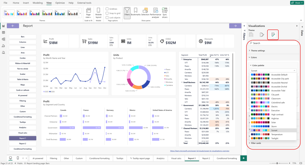
Conditional formatting now extends to line charts and visuals with legends, which was a long-standing community request. The practical win is colour consistency: drive a segment's colour from a single DAX measure and every visual using that legend picks it up, so changing one measure re-colours the lot. Line charts can also take a gradient based on each line's total or category, which is handy for fading older years into grey while the current year stands out.
Rounding out reporting, page tab navigation is less fiddly now. Dragging a tab toward the edge of the bar keeps scrolling until you reach the spot you want, which makes reorganising reports with a lot of pages far less painful.
Org apps with audiences reached general availability, and it's worth treating the related changes as one story. You can now deliver different content to different groups from a single governed app, so one group sees finance and another sees operations, rather than juggling separate apps. Bookmarks now work inside org apps (both author-created and personal), report pages and visuals can be embedded into PowerPoint via Storytelling, and audiences now flow through to the iOS and Android apps. For people who work mainly in the mobile app, that last one closes a real gap.
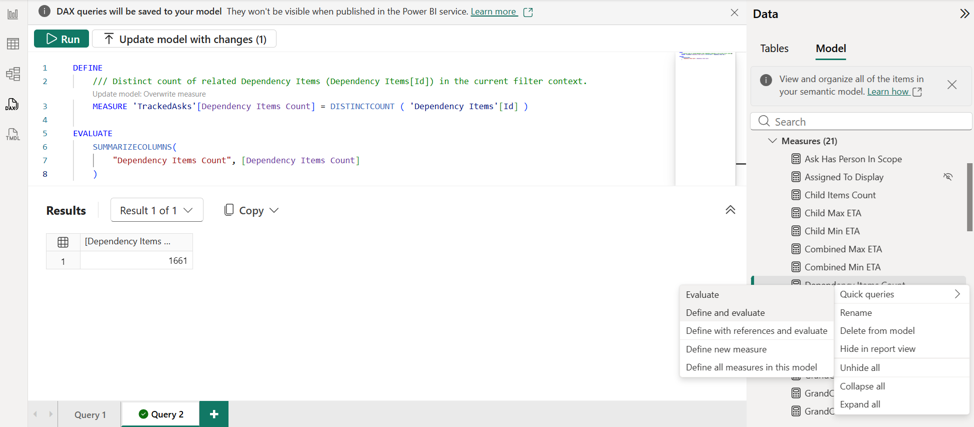
A small but welcome change: you can now write measure descriptions inline using triple-slash (///) comments, right above the measure definition, instead of switching over to Model Explorer. The description travels with the measure into tooltips and generated queries, which nudges models toward being self-documenting without any extra effort.
More web modelling capability landed too. Model Options are now available in the Power BI Service, so settings like time intelligence, relationship auto-detection and DirectQuery behaviour can be configured without dropping back to Desktop. TMDL View also arrived on the web, letting you script model changes as code in the browser, which is useful for bulk edits and repetitive tasks. And a heads-up worth noting: from August, opening semantic model settings in the Service defaults to the new settings pane rather than the full page. Everything's still there; it just opens beside your work, and you can switch back if you prefer the old page.
The OneLake Catalog's Govern tab gained something genuinely practical. Its recommended actions, such as increasing label coverage, removing unused items or chasing failed refreshes, now list the specific items behind each recommendation, complete with owner, location, endorsement and sensitivity, plus a direct link to fix them at the source. Previously you were told what to improve but left to hunt down the affected items yourself, which is usually where the follow-through stalled.
On the warehouse side, two items are worth a mention. The new Lakehouse table health check is a single T-SQL stored procedure (sp_get_table_health_metrics) that flags common layout problems like small files and fragmentation, so you can optimise proactively and even wire it into a pipeline. And usage-based resource estimations in the query optimiser now correct both under- and over-estimation using actual row counts from past runs. The result is fewer spills, less wasted capacity, and nothing for you to configure.
A few Data Engineering items are worth attention this month. Fabric Runtime 2.0 is in preview, bringing Spark 4.1, Delta Lake 4.2 and Python 3.13, along with a longer support window for enterprise workloads. More immediately useful day to day is the new Lakehouse Query Explorer: a built-in editor for running Spark SQL right where your data sits, with IntelliSense, a results grid and inline charts, so quick validation no longer means spinning up a notebook or hopping across to the SQL endpoint.
Event-driven refresh for Materialized Lake Views (preview) is a sensible piece of plumbing. Instead of refreshing on a fixed schedule, a view can refresh the moment its source data lands or its upstream job finishes, driven by OneLake or pipeline and notebook events. That means less compute wasted on empty runs and fewer stale results between scheduled slots.
Fabric Maps Tilesets is now generally available. It turns geospatial data already sitting in OneLake into fast, interactive maps without custom code or a separate GIS setup. Asset networks, service areas, boundaries and routes become part of the analytics workflow rather than a separate exercise.

Fabric's AI functions went generally available with gpt-5-mini as the default model, usable across pandas, PySpark, Data Warehouse and Dataflows Gen2. The pandas path no longer needs the openai-python package, and there's clearer token-usage reporting for keeping an eye on cost. If you've been curious about AI-assisted transformations in your data prep, the barrier to entry just dropped.
Plenty to test in a sandbox this month. The reporting and modelling items in particular are the sort you'll feel straight away.
Sources: Fabric July 2026 Feature Summary and Power BI July 2026 Feature Summary

Get the latest Talos Newsletter delivered directly to your inbox
TECHNOLOGY PARTNERS
Our partners including Microsoft, UiPath, Databricks & Profisee enable us to deliver business outcomes using best of breed technologies and solutions.




Automation & Analytics Technologies for Business

Talos helps organisations build reporting solutions using Jet Analytics

Australian councils face backlogs, staff turnover, and rising community expectations. We help you improve service delivery and operational efficiency through process automation — integrated with TechnologyOne, Civica, and Pathway.
Talos helps organisations build modern data and analytics platforms using Databricks, Microsoft Fabric and Power BI. We work from strategy through implementation, ensuring you get value from the platform without unnecessary complexity.